The utility analysis lost its popularity because of its assumptions like utility can be measured, marginal utility of money remain constant. To replace these old concepts the modern economists have introduced an indifference curve analysis. This technique was originally developed by F.Y Edgeworth in 1881. Later picked up by Irving Fisher, who tried to give a concrete shape to it in 1892.It was further developed by Pereto. In 1931, I.R Hicks and Allen gave a scientific treatment to this new analysis, Indifference curve analysis is now being used in the analysis of many economic problems.
The indifference curve analysis excludes all the defects of utility analysis. It is based on ordinal utility. Here utility cannot be measured but it can be ranked. It expresses the dissatisfaction in terms of scale of preference. That’s why it is called ordinal approach.
According to indifference curve analysis utility can’t be measured but it can give preference or ranking for different combinations of two or more goods for ex x and y, which gave the same satisfaction. Therefore the consumer can select any good in the combination. So it is called as preference approach.
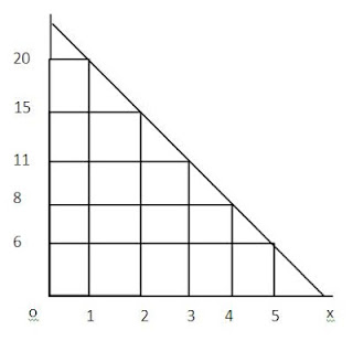
The indifference curve shows the various combinations of commodities which give sane satisfaction to the consumer. The consumer may think of several commodities but for out convenience and simplicity we shall assume two commodities only. An indifference schedule may be defined as a schedule of various combinations of two goods that will be equally acceptable to the consumer. The various combinations of the following two goods give the same satisfaction to the consumer.
Indifference Schedule
The above indifference schedule shows the various combinations of the two commodities which derives same satisfaction. The consumer is indifferent between these combinations which yields same satisfaction. Now we can trace the indifference curve with the help of indifference schedule.
In this diagram the ox axis represents apples and oy axis represents oranges. IC curve is the indifference curve. This curve shows the five combinations of two combinations that is 20 oranges and 1 apple, at point A, 15 oranges and 2 apples at point B. In this way the combinations of the tow commodities continues up to point E. If we join all these points we can get IC curve. It is called indifference curve.
Indifference Map
In the above set of indifference curve the consumer is able to derive a particular quality of satisfaction. Suppose if he wanted to get more satisfaction this process of combination must be continued. For this purpose we have to draw another indifference curve which is parallel to the previous indifference curve. This can be shown in the following diagram.
This indifference maps shows the equal satisfactory combinations of the commodities at each level of total income. There are various terms in this indifference map such as IC1, IC2, IC3, IC4, etc. All the points on any one of the curve give the same satisfaction.
For example - Point AB on IC give the same satisfaction C and D point on IC2 give the same satisfaction. Suppose if the consumer wanted to get more satisfaction he has to go for higher indifference curve. So every indifference curve which moves upwards in the form of IC2, IC2, IC3, IC4 give higher satisfaction to the consumer. Accordingly IC2 yields greater satisfaction than IC1 and IC3 will be greater than IC3 etc.
This indifference map represents a collection of indifference curves. Each curve shows certain level of satisfaction to the consumer. The different IC curves are numbered in ascending order, as shown in the diagram. So every IC curve which comes on right side derives greater satisfaction and left side curve gives lesser satisfaction.
Notes provided by Prof. Sujatha Devi B (St. Philomina's College)
Notes provided by Prof. Sujatha Devi B (St. Philomina's College)


Post a Comment